
AMMA
AMMA
Companion Asthma Monitoring and Management App, or ‘AMMA’, for a wearable health device previously built by Google.org to help people with asthma monitor their condition.
CHALLENGE:
To understand the daily rituals and needs of an Asthmatic as well as the medical perspective on what methods have the highest success rates for adherence to medicine regimens and daily recording.
CLIENT: DesignLab (UX Academy Case Study)
ROLES: UX, UI, Branding
TOOLS: Sketch, InVision, Usability Hub
TIMELINE: 3 Weeks
Research
Starting this project I had very limited knowledge of Asthma, so I dove head first into research. My main objective was to try and understand how Asthma can affect one’s body and what existing key predictive indicators, if any, could be leveraged to detect when an attack may be on the horizon. At the forefront of my mind was also the higher stakes that come with designing within the healthcare sector to provide an efficient, intuitive, and reliable product people feel comfortable using even during high stress situations.
Competitive Analysis
I began researching by going to medical repositories such as WebMD, MayoClinic, and National Heart, Lung and Blood Institute to familiarize myself with how Asthma affects the body as well as the proper medical terms and regimens. After developing a good foundation, I examined the market to see if there were any similar pre-existing products or gaps AMMA could capitalize on to differentiate themselves from the pack.

Provisional Persona
Next, it was time to figure out WHO the ideal users of AMMA would be. I captured my initial thoughts in the form of a provisional persona:
Survey and Interviews
40 Online Survey Responses | 2 Interviews with Asthmatics | 2 Interviews with Healthcare Professionals
Expanding upon this persona, I went to where I thought Asthmatics would hang out - Reddit and Facebook groups. I went through and read about their experiences, struggles, and needs to gain a better understanding from a large sampling. I was ecstatic when I received over 40 responses to a survey I introduced to these communities, finding it really comforting to know the audience was interested in the product and receptive to sharing their experiences.
I knew it would likely be hard to find users who matched this persona based on the tight deadline I was working with, so I started looking through my immediate circle and discovered 2 individuals who had severe cases of Asthma in the past but now have their conditions under control. If I had more time, I would have found participants who better matched Betty’s profile. In addition to these 2 participants, I was also fortunate enough to speak with 2 nurses and view Asthma and Asthma management through their eyes.
Some of the most impactful quotes I heard during this process were:
“I’ve become attuned to my body and now know the peak between
’I’m fine’ and ‘I’m going to have an attack if I keep going’.”
“I like using medical tracking apps because it’s easier and more reliable to
just take my phone to the doctor and review records during appointments
than for me to record and remember information on my own.”
“Education is lacking for Asthma patients and sometimes communication
breaks down among doctors, nurses, and patients which is unfortunate.”
“Asthma’s all about triggers - if a kid’s running outside in proximity to a lot
of their triggers that’s probably not the best place for them to be.”
“Integration with popular Electronic Medical Record (EMR) programs like
EPIC and Care Everywhere would be fantastic! It would allow crunched
for time doctors and nurses to look at data and prepare before appointments.”
Persona and Empathy Map
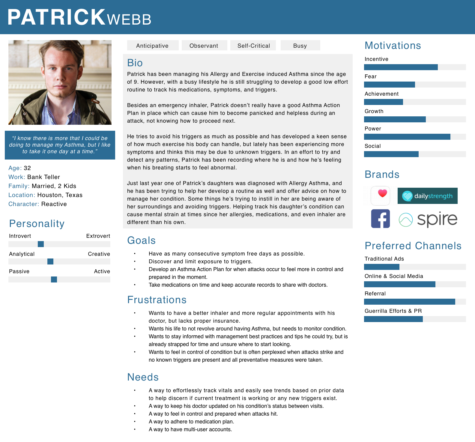
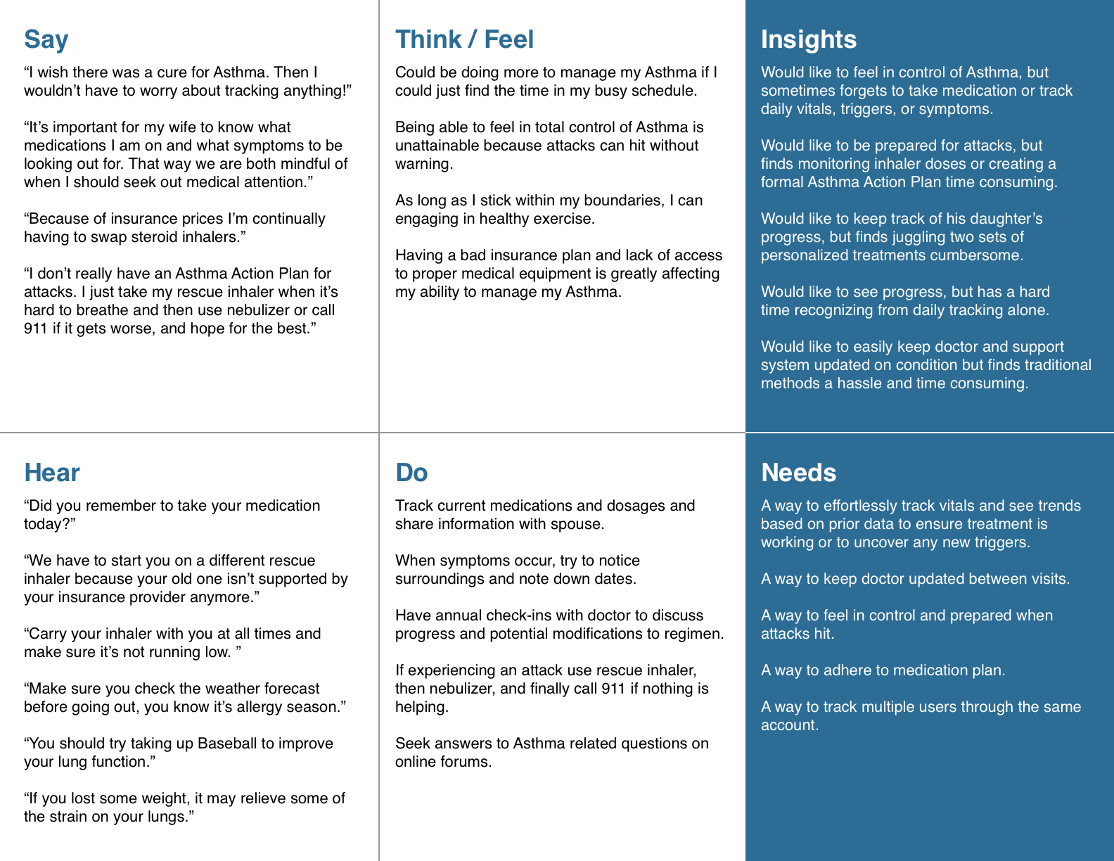
Taking what I had learned through the survey and interviews, I created a final persona and empathy map to complete the vision of AMMA’s ideal user.
Structure
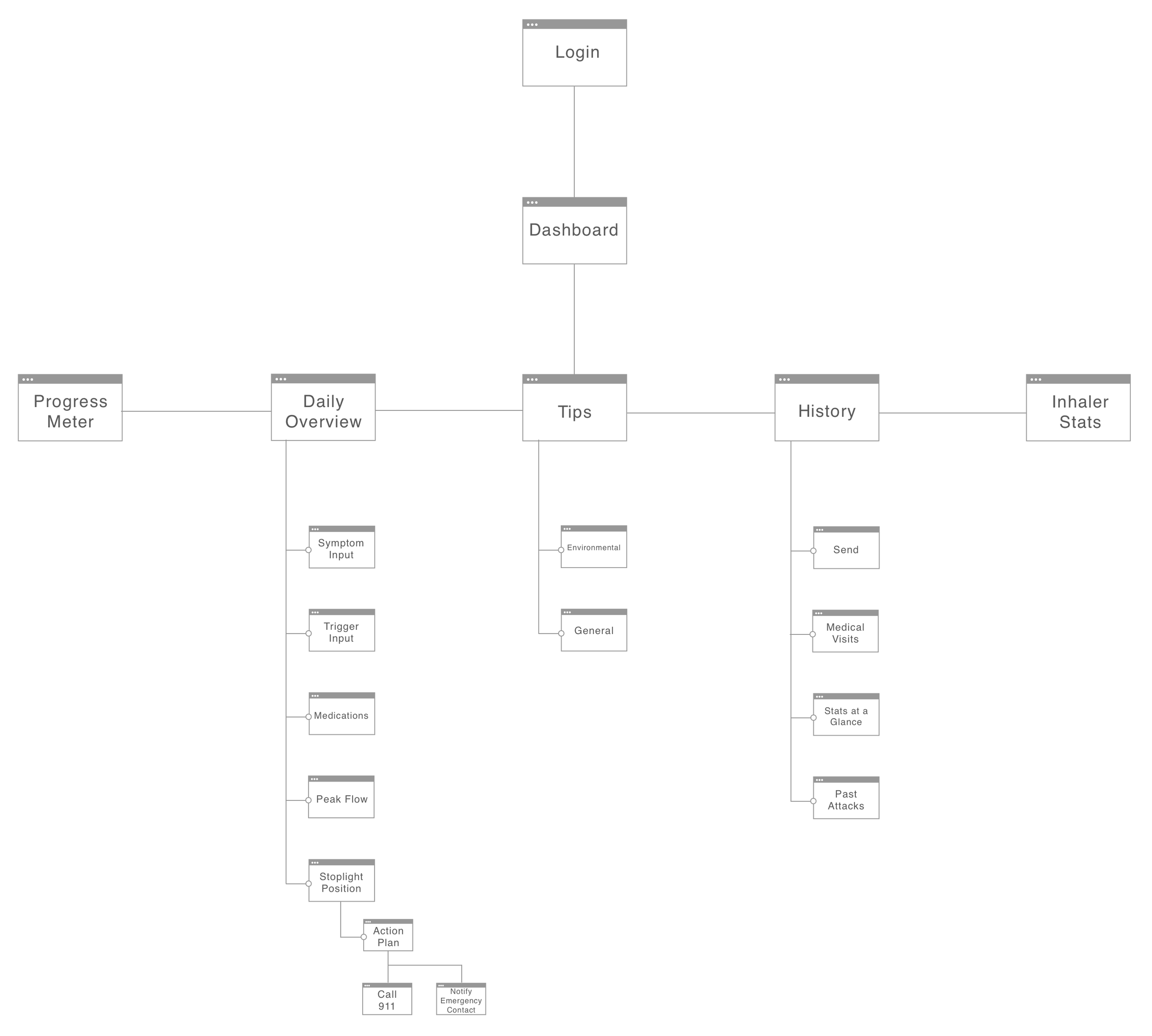
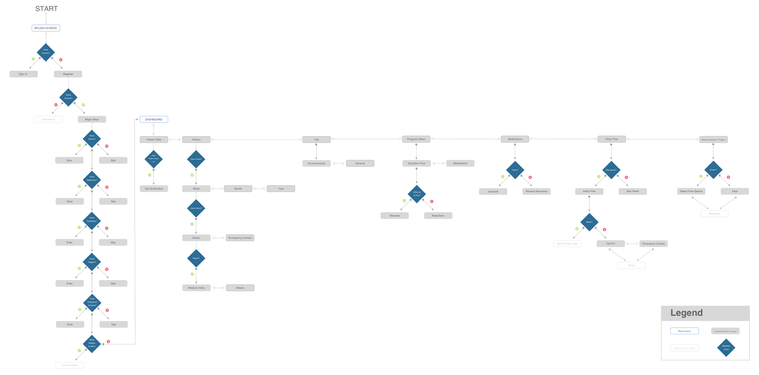
After gaining a better understanding of WHO I should be tailoring the design towards and what their goals and frustrations might be, it was time to figure out how the app’s content should be laid out and the flow between steps choreographed, so I created an application map and user flow.
Application Map and User Flow
As you can see, there are a couple of main ideas at play in these diagrams:
Multiple Profiles available through the same account since Asthma tends to be a genetic condition.
Initial Setup Walkthrough to help users personalize their profiles and create quick selection options that can also be used for more efficient reporting later on.
Daily Dashboard for a quick snapshot view of how their day is going so far and what actions they may need to take to help accumulate more symptom free days.
Action Plan Walkthrough that takes the user through their doctor approved personalized action plan once they enter into the Yellow Zone and notifies when reach the Red Zone and need to seek medical attention or get in touch with their Emergency Contact(s).
Ability to View and Send Charts to Doctors and Others through the History screen to keep everyone informed of their current condition and seek advice on any trends or irregularities of concern.

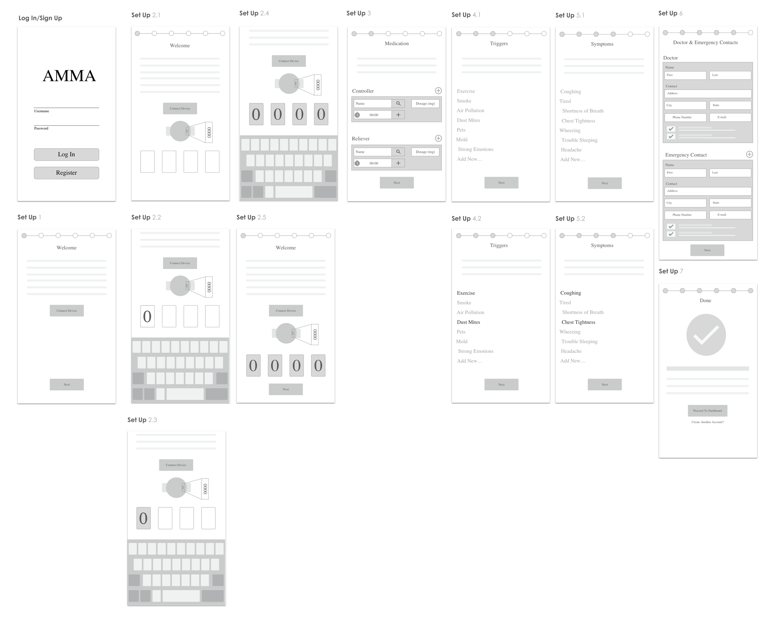
Low Fidelity Wireframes
Next, it was time to start imagining how these concepts could be laid out visually through some quick, low fidelity, wireframes:
Usability Testing
To begin observing customer behavior and understand what may or may not be resonating within the designs, I first created an interactive prototype in InVision. Next, scenario based task plans were created for both in-person and remote usability testing. In person tests focused on setting up an account, adding symptoms and triggers, checking peak air flow, and following an asthma action plan walkthrough while remote usability tests focused more on setup walkthrough pagination and symptom rating.
Key Findings:
Users felt trapped in the setup process if not allowed to go back to previous steps or able to skip over screens like the doctor and emergency contact step if they don’t have the information readily available at that time.
Were confused by Relief and Controller Medication labels.
Wanted units for Peak Air Flow.
Wondered why the connect device and next buttons were active at the same time on the Connect Device step.
Wanted to swipe left / right on dashboard to look at previous daily histories.
Visual Design
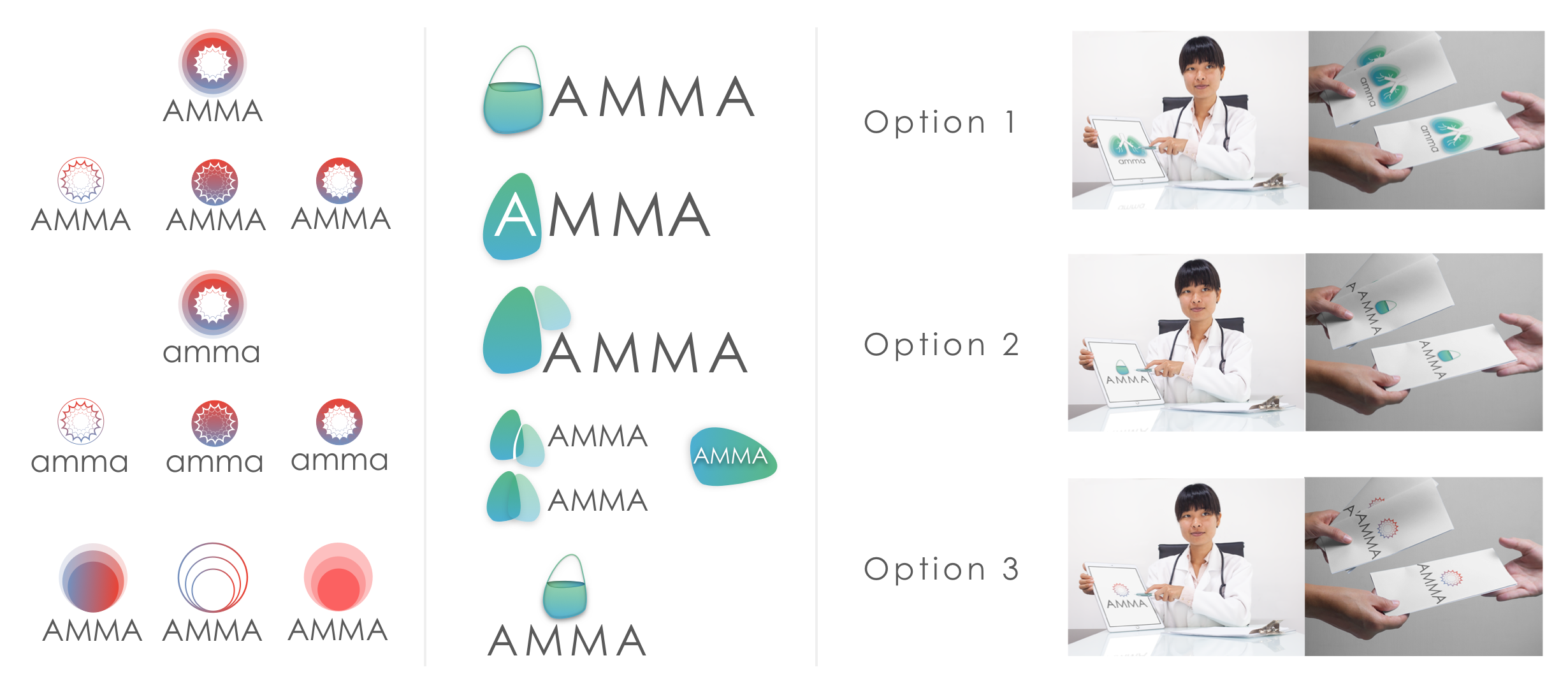
Branding & Style Tile
I played around with many different concepts for AMMA’s branding, but in the end I went with a design that drew inspiration from the dynamic nature of an Asthmatic’s bronchial tubes in relation to calm and attack states while also providing a sense of hope that AMMA can aid in tracking and managing their condition. The outer ring represents the bronchial tube itself and the three concentric circles within, the progressive closing up of airways. This theme of progression felt appropriate to me as an Asthmatic’s life is constantly dependent on the percentage of air their lungs are circulating and what zone they are in.
A gradient was utilized across branding as it aligned with the theme of progression while staying current to design trends. When it came to selecting a color palette I originally contemplated a red-blue gradient since those colors are often found within medical diagrams representing arteries and veins. But ultimately felt the blue and green palette would better represent the brand providing a sense of security, health, and serenity.

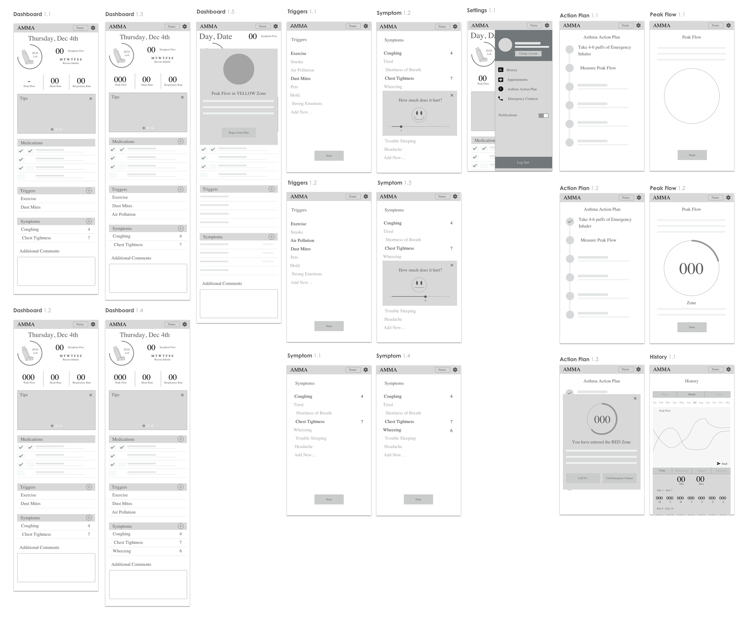
High Fidelity Wireframes
Based on feedback gained through usability testing, a final set of high fidelity wireframes were created.
Some of the changes incorporated into these screens include:
A redesign of the setup progress meter to help users better orient themselves within the screens.
Eliminated the inhaler capacity tracker due to time constraints not allowing for proper solutions to all of the issues that revolved around its implementation. Would be revisited for future versions.
Relabeled the Controller and Reliever Medications to “Long Term Control” and “Quick Relief”.
Added a Skip feature to the Doctor and Emergency Contact screens.
Reformatted the Action Plan to include more complete descriptions.

Landing Page
A product landing page intended to showcase what AMMA has to offer was also created. I took a bit of inspiration from Propeller’s website as well as Google’s current Drive and Docs product page layouts to remain consistent with the brand. A clean, minimal approach was taken with the layout and imagery to exude a sense of tranquility and happiness - both states of mind AMMA hopes to bring to their users.
