
Tidal tURNup
TIDAL is an online music streaming service looking to launch a new shared listening feature, TIDAL TurnUp, that will allow subscribers the opportunity to listen to music together, simultaneously regardless of physical locations.
CHALLENGE:
To create a simultaneous listening experience for users within the existing TIDAL app while maintaining consistency to current features across function and feel.
CLIENT: DesignLab (UX Academy Case Study)
ROLES: UX, UI
TOOLS: Sketch, InVision, Usability Hub
TIMELINE: 2 Weeks
RESEARCH
Before this project I had very limited knowledge of TIDAL and the services they provide, so first I wanted to get to know the existing product. While examining the desktop and app interfaces, I noticed a dark muted palette utilized to highlight the albums and artists themselves along with a bright blue accent color for CTA and navigational elements. Some of their unique offerings were HD music videos and shows, exclusive albums and videos only available through the service, and a suite of features that fostered a more in-depth lens into the artists themselves including a dedicated portal to up and coming artists called “TIDAL Rising” and articles written from interviews conducted with artists.
Competitive Analysis
Once I understood TIDAL a little more, it was time to get a better picture of where they stood in the market with a competitive analysis.

Provisional Persona
Next, it was time to figure out WHO would be the ideal users for TIDAL TurnUp. I began with a provisional persona to capture my initial assumptions of who I envisioned the users to be and what attributes they would have:

Survey and Interviews
13 Online Survey Responses | 3 Interviews
Using this representation of who I thought the target audience was, I went out into the field and tried to find and chat with people who aligned with Harper. In these interviews I was looking to better understand their motivations, needs, pain points, and goals in relation to listening to and sharing music with others.
Some of the quotes that stood out to me from participants included:
“I like being surprised by my music, getting to listen to things I may
not have found on my own.”
“Music is a part of everything we do, and listening to music should be a
bonding experience like it was intended to be.”
“Sometimes I’ll text screenshots of songs I think my friends will like only to
be left wondering later on if they actually did listen to it.”
“I’ve discovered some of my favorite artists through the related artists
feature on Pandora. That’s how I found Imagine Dragons, off of
a Mumford & Sons station.”
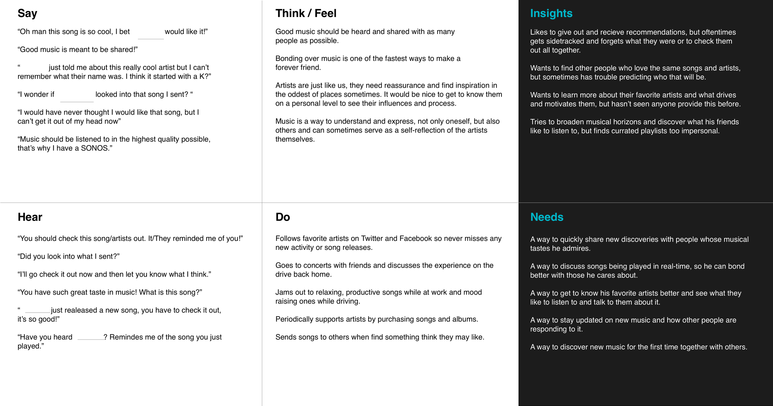
Persona and Empathy Map
I combined all of these findings into a final persona and empathy map:

Structure
Application Map and User Flow
After determining WHO I was designing for, it was time to further clarify WHAT should be designed and HOW.
To answer these questions, I created an application map and user flow. These helped illustrate the best location for the TurnUp feature within the current TIDAL app structure as well as what screens should be included and what the ideal flow between them might look like.
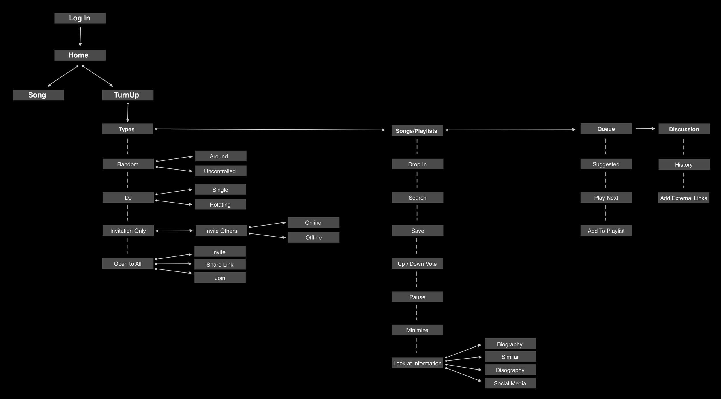

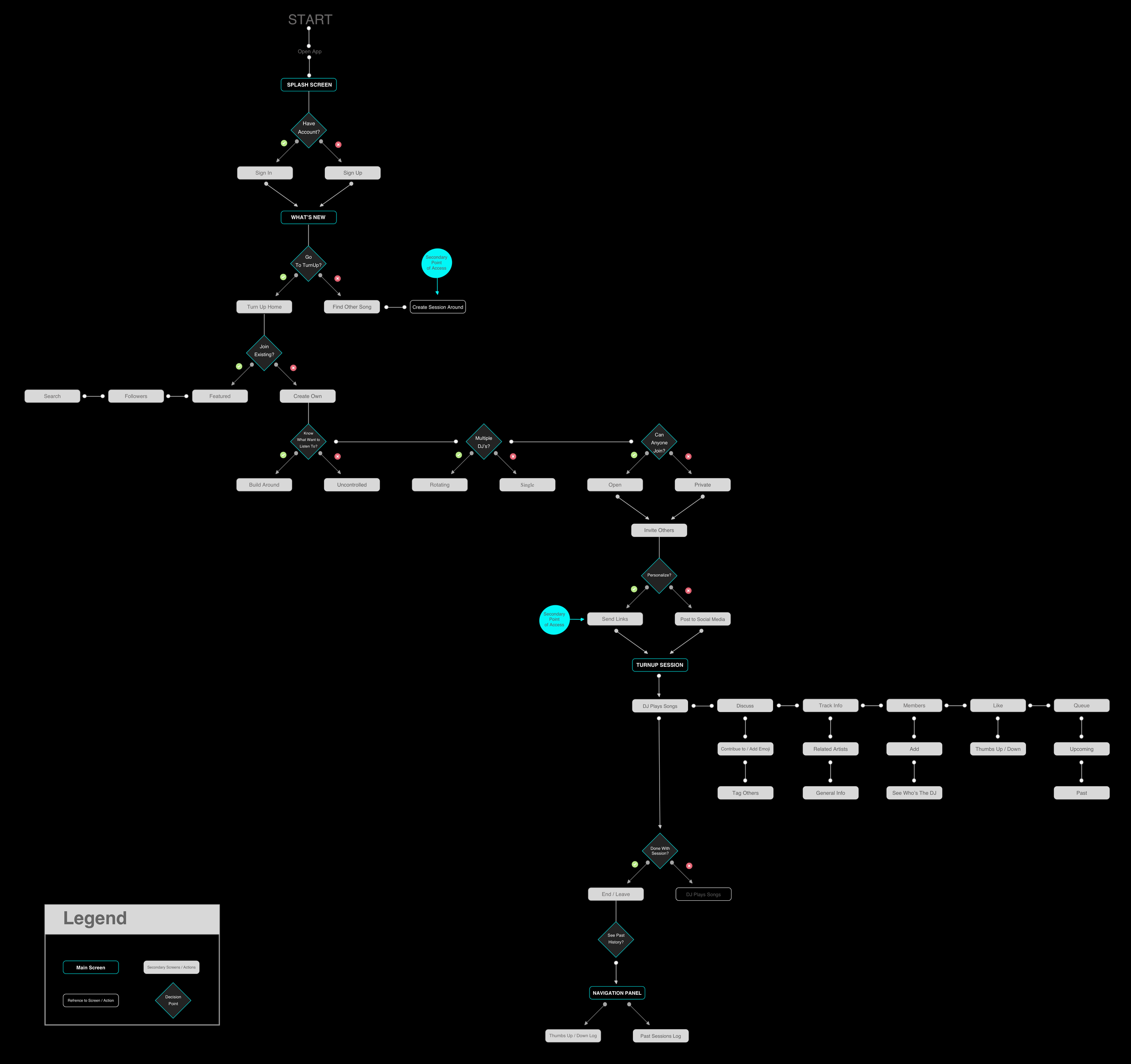
Some of the main ideas from these diagrams include:
Customization of TurnUp sessions based on preferences such as single or multiple DJs, random or build around playlists, and private or open access.
Integration into the profile menu with the same designation as TIDAL’s other music portal “TIDAL Rising”.
Option to join open sessions hosted by artists or people you are following directly from the home screen or TurnUp portal.
Up/Down songs currently being played.
Quick display of all current session members as well as the DJ.
Discover related artists and songs to the one currently being played.
Low Fidelity Wireframes
To get a rough, quick idea of how the concepts from the application map and user flows could be laid out visually, low-fidelity wireframes were created:

Usability Testing
Next, in order to understand how these designs would resonate with users similar to Brant, I created an interactive prototype and conducted remote and in-person usability tests. Focus areas for in-person tests included: locating the TIDAL TurnUp feature, creating a listening session, and exploring a listening session room. Remote usability tests focused more on iconography recognition and logging in.
Key Findings:
Users wanted to be able to go back to settings from the invite screen and have the option to send out additional invites after the session had begun.
Unanimous confusion over the related artists, member, and queue icons.
Add new response button wasn’t immediately recognized.
Felt current way to see other session members may prove problematic for larger groups due to screen real-estate.
VISUAL DESIGN

High Fidelity Wireframes
Finally, high fidelity wireframe were created that incorporated the usability testing insights.
Some of the changes made to the screens include:
Redesigning the queue, discovery, and member icons within the TurnUp session rooms.
Creating better consistency with the TIDAL Rising feature overview by replacing the TurnUp feature’s hero image with a duotone illustration.
Rearranging the TurnUp session rooms to provide more space for the bottom navigation tabs.
Moving the “Current DJ” designation underneath the song title and artist.